Overview
Waterfall AI needed a bold, modern brand system that communicated speed, clarity, and intelligent automation. This project includes the full identity refresh: logo, typography, color, UI, and product applications.
The Challenge
Spreadsheets are powerful but visually overwhelming.
My challenge was to create a brand experience that feels fast, intuitive, and unmistakably modern — while still feeling technical and reliable.
Identity Direction
Copy:
The identity centers around two ideas:
flow (automation in motion) and insight (clarity from complexity).
These concepts shape the wave-based glyph, the neon Lime palette, and the clean geometric typography.
Typography
Satoshi serves as the primary typeface for UI and brand communications, delivering clean structure and legibility.
Space Grotesk is used for data, metrics, and accent typography to reinforce a futuristic, analytical tone.
Color Palette
Lime brings energy and visibility, while Lavender adds balance and cool contrast.
Together, the palette creates a high-contrast environment optimized for dashboards and dark-mode interfaces.
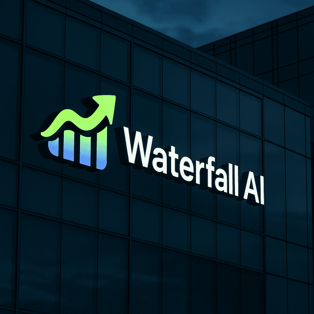
Logo System
The Waterfall AI mark combines upward motion, data flow, and clarity.
Lockups scale across product surfaces, marketing, and digital applications.
UI Exploration
The product UI applies the brand system across insights, charts, metrics, and automation flows.
Dark mode provides a crisp foundation for Lime accents and data visualization.
Brand In Context
To demonstrate versatility, I extended the identity to real-world applications — from hardware to apparel and digital touchpoints.
Outcome
The final system is clean, high-contrast, and dynamic — built to scale across product, marketing, and team environments.
Waterfall AI now has a distinct, future-ready identity that reflects the intelligence and speed of the platform.